Amerta Ubud
Boutique hotel · Brand identity
Amerta Ubud is a small hotel for travellers who come to Bali to slow down. The identity borrows the split temple gate (candi bentar) and the morning sun, then sets them in terracotta, jungle green and rice-cream tones, so everything from the key tag to the booking page feels calm, local and handmade.
The brief
Create a brand for a 14-villa boutique hotel that competes with large resorts on character, not size. It needed to work on physical touchpoints guests actually hold (key tags, door hangers, amenities, menus), drive direct bookings online, and feel rooted in Bali without falling into cliché.
The idea: the gate to a slower day
In Bali, the candi bentar split gate marks the passage from the outside world into a sacred space. Amerta's mark is that gate with the sun rising between its halves: arriving is the moment the day slows down.
Where it lives
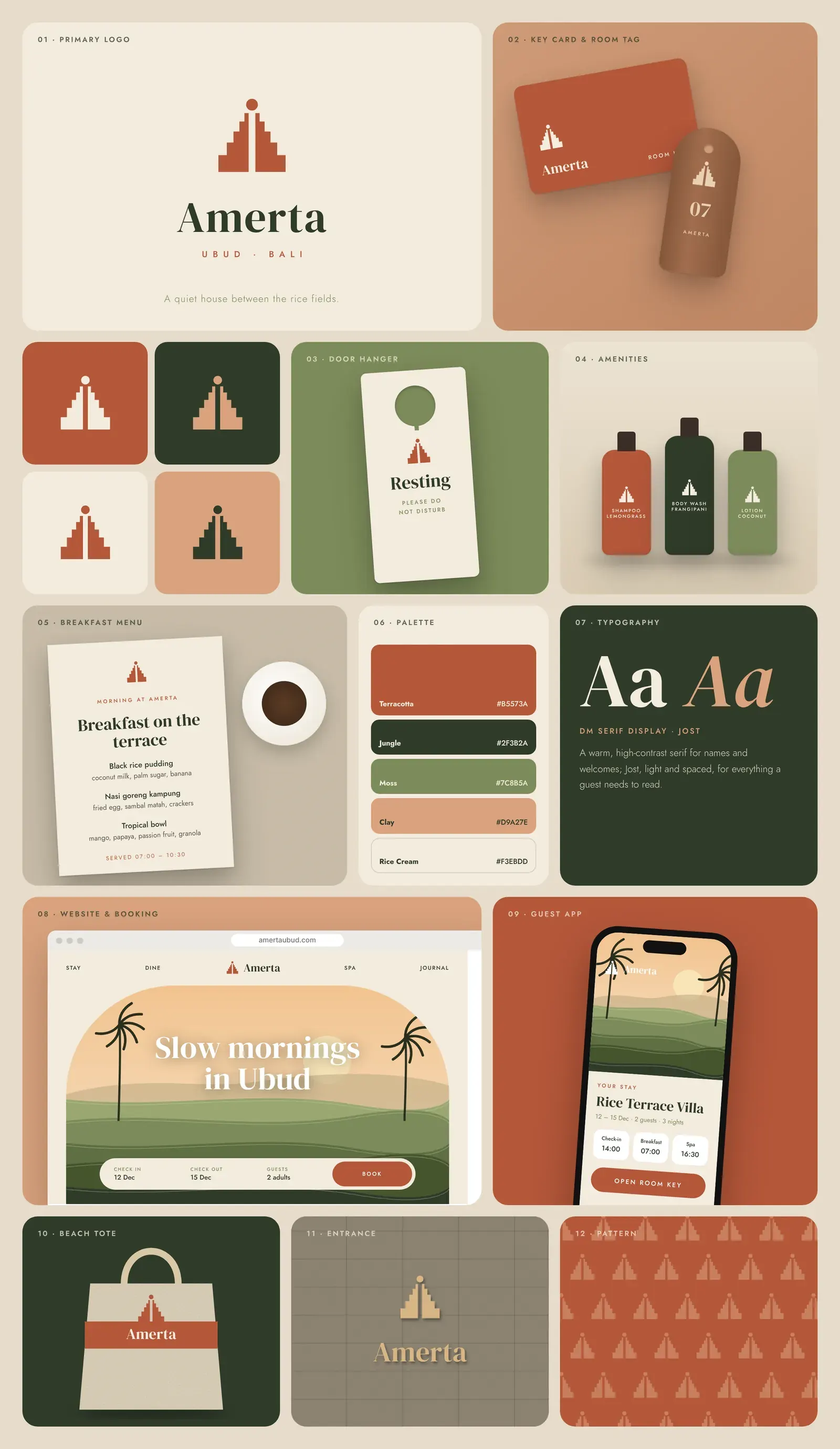
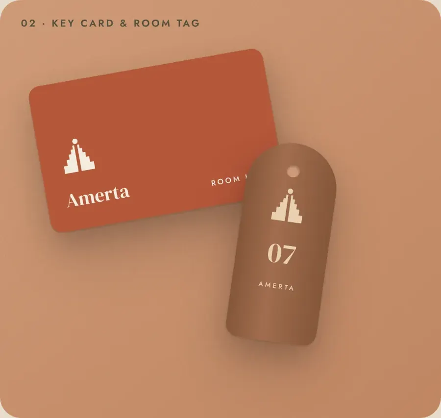
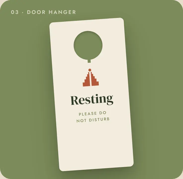
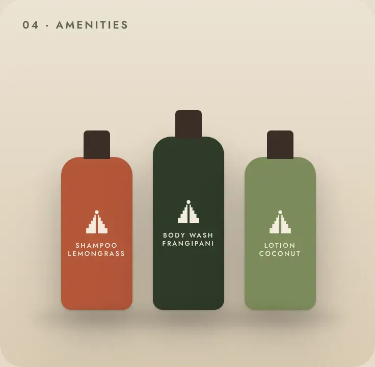
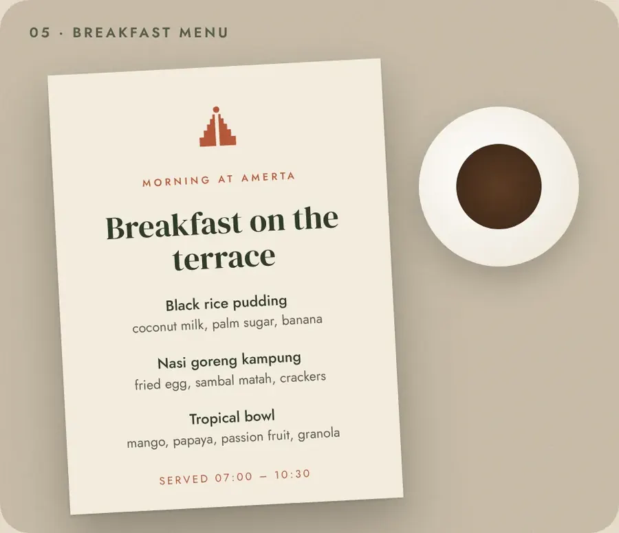
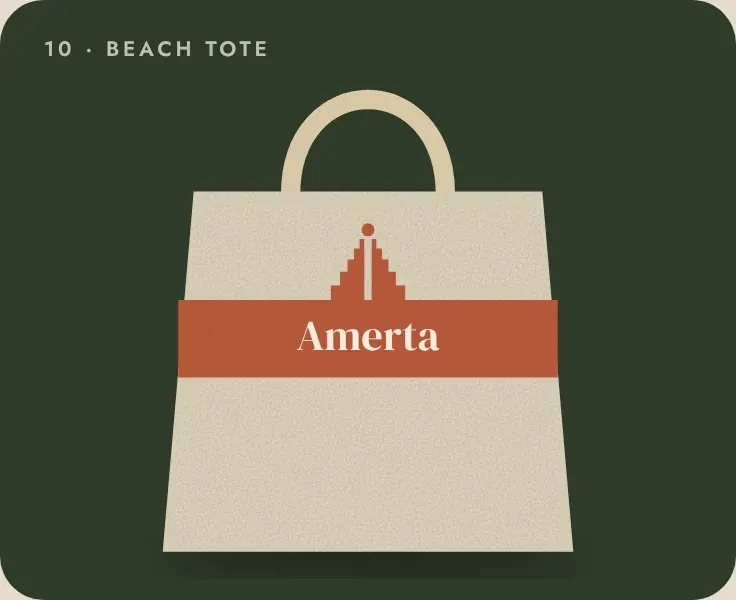
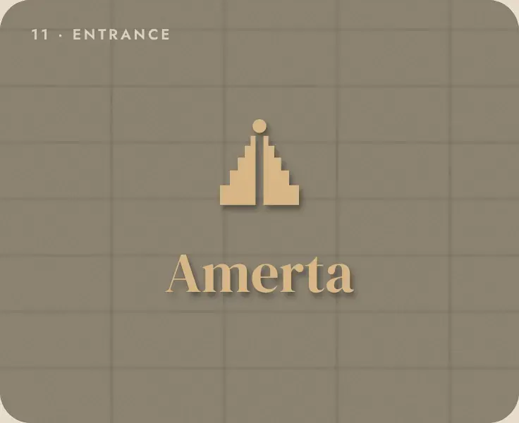
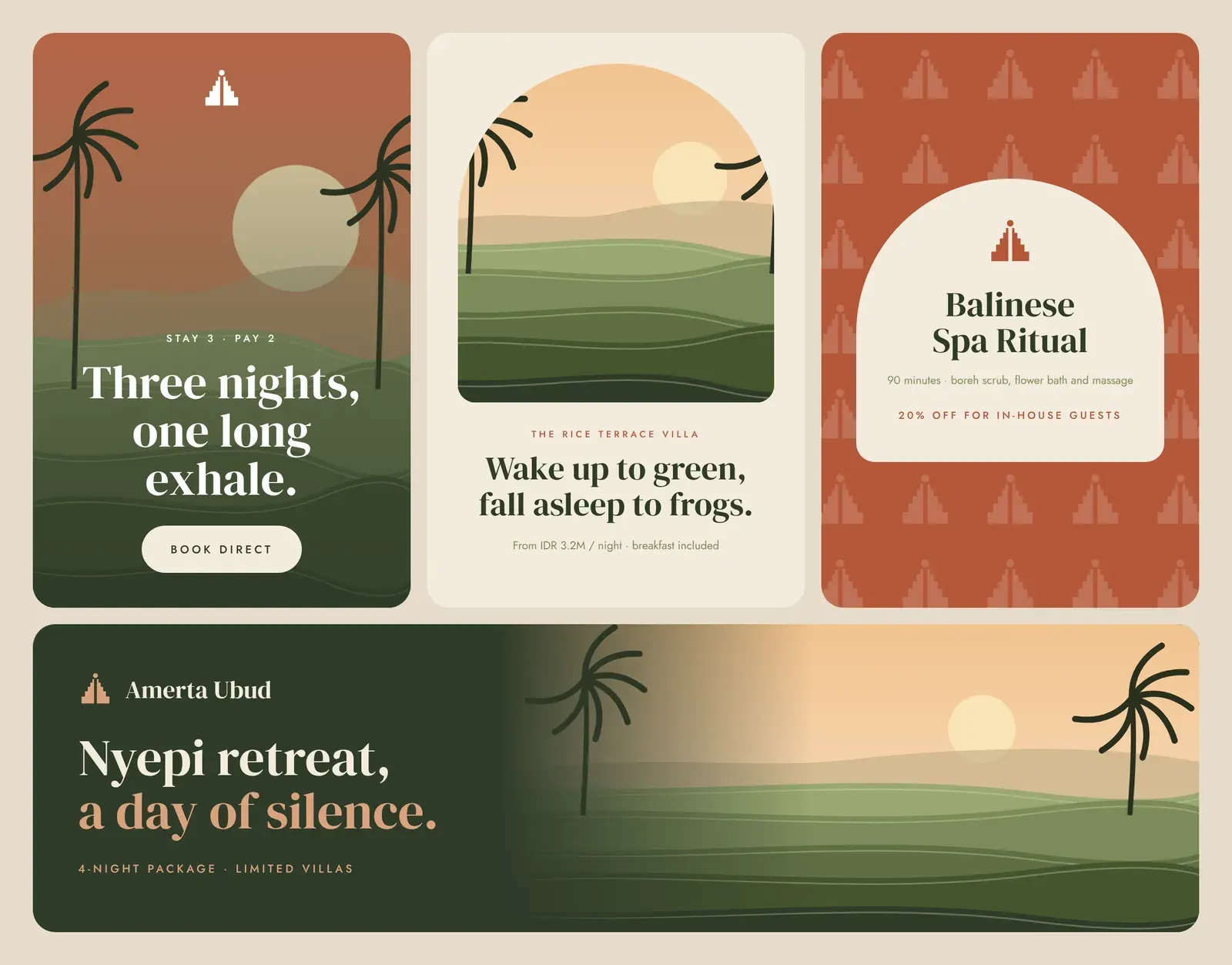
Key card and wooden room tag, door hanger, amenity bottles, breakfast menu, beach tote, carved entrance sign, gate pattern, direct-booking website, guest app, and a seasonal social campaign (Stay 3 Pay 2, villa launch, spa ritual, Nyepi retreat).
Brand board
The identity across print, packaging, digital and environment.
Identity system
The decisions behind the brand.
Name
Amerta means the nectar of life in Balinese and Old Javanese tradition. It is soft to say and easy to remember.
Logo
a stepped, symmetrical gate and a rising sun, built from simple geometry so it can be carved in stone, branded on wood or stitched on linen.
Colour
Terracotta #B5573A (roof tiles, clay pots), Jungle #2F3B2A, Moss #7C8B5A, Clay #D9A27E and Rice Cream #F3EBDD, the colours of a walk from the lobby to the paddies.
Typography
DM Serif Display for warm, high-contrast names and welcomes; Jost, light and spaced, for practical information.
Voice
sensory and slow. "Slow mornings in Ubud." "Three nights, one long exhale."
Applications
Selected touchpoints from the identity.
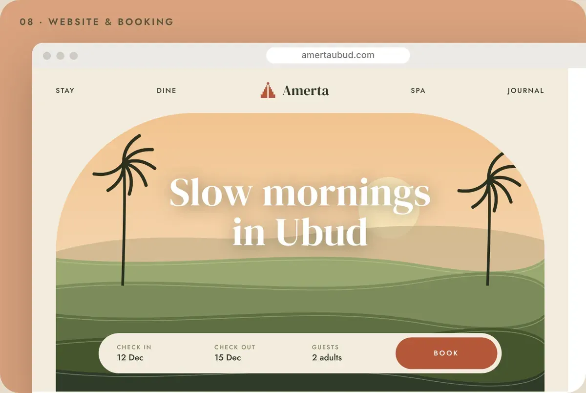
Website
The identity carried into the online experience.
Social campaign
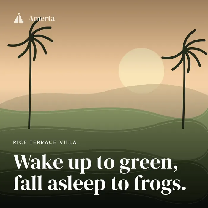
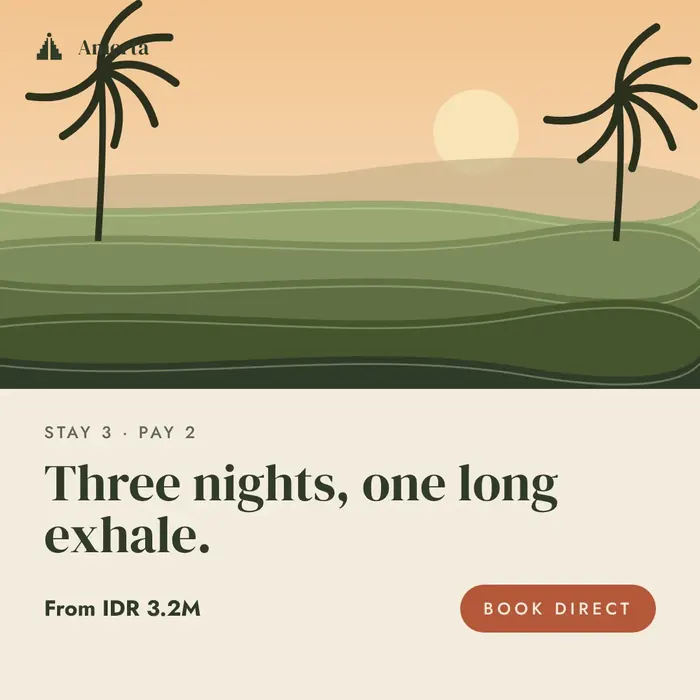
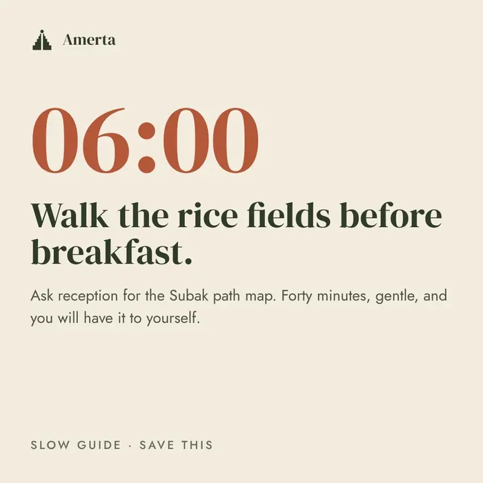
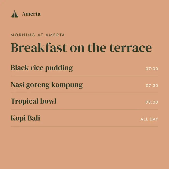
“Slow Season”. A rainy-season campaign that sells slowness: villas, spa rituals and the Nyepi retreat, with direct-booking offers.
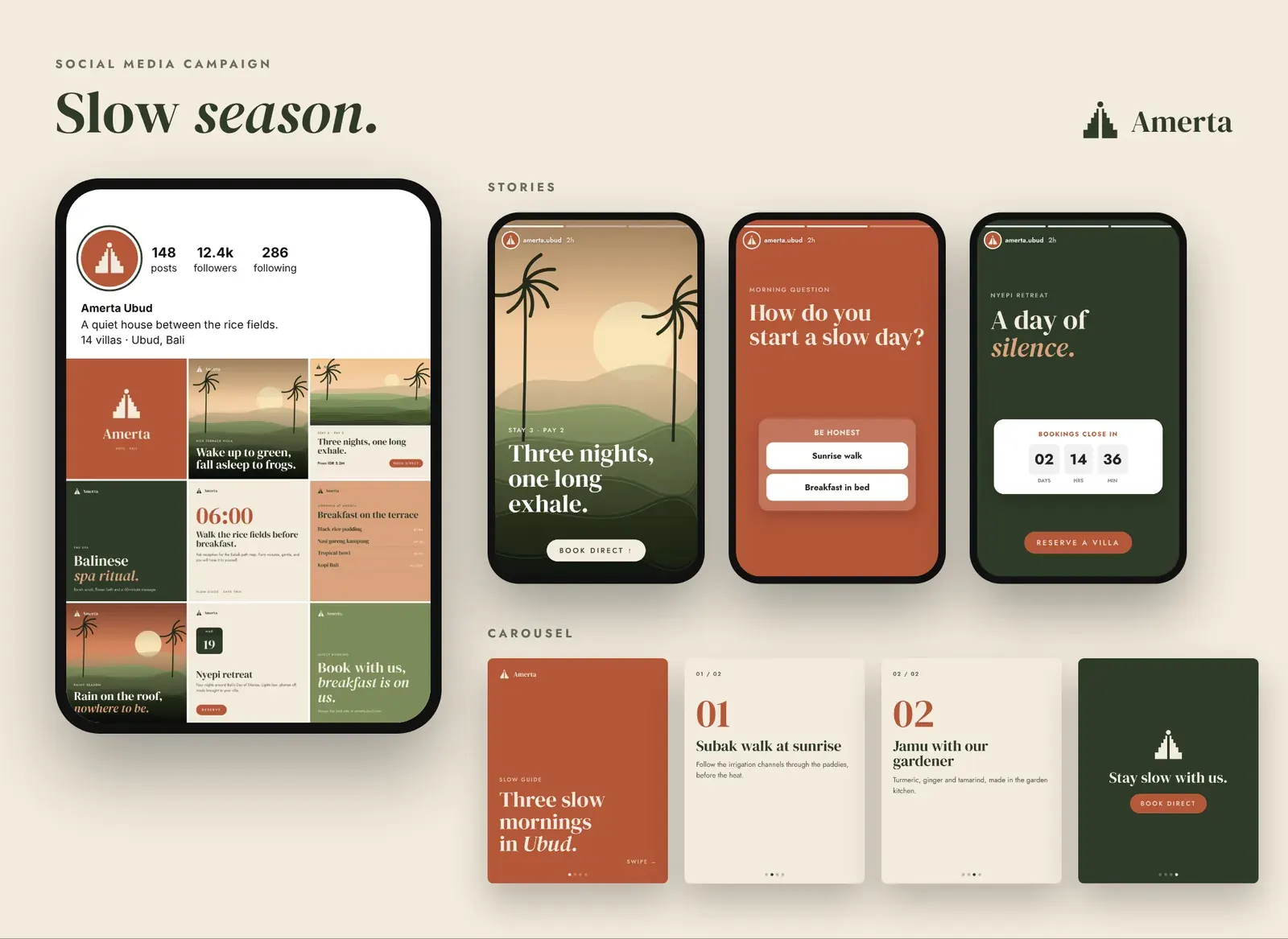
Feed posts
Six posts from the nine-post grid, 1080 × 1080.

Ad creatives
Story, feed and banner formats for paid social.
Concept project: a fictional brand created to show our brand-identity process. Names, prices and offers are illustrative.
What we delivered
Everything handed over at the end of the project.
Logo suite & colourways
Colour & type system
Pattern
In-room collateral
Amenity labels
Signage
Website & guest app UI
Social media templates
Kelana