Kinetik Studio
Fitness studio · Brand identity
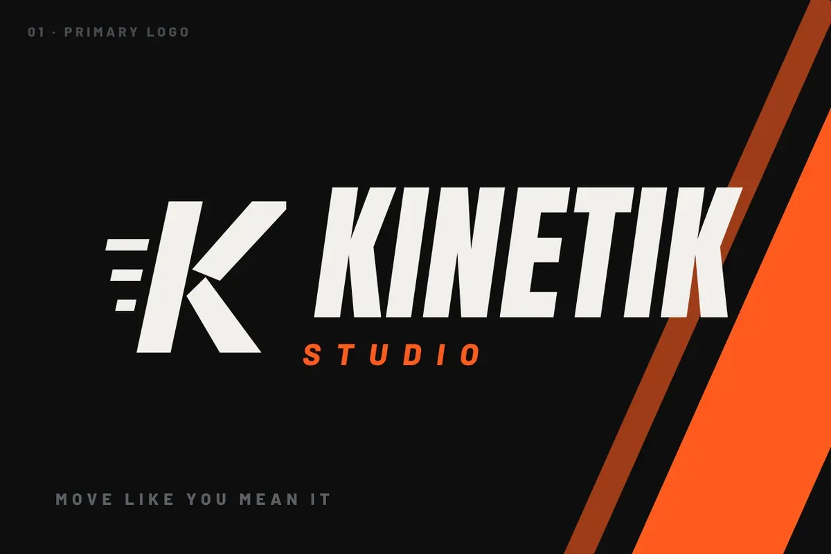
Kinetik Studio runs coached HIIT, strength, boxing and ride classes for people who want to be pushed. The identity is built on motion: a K with speed lines, condensed type slanted forward, diagonal blaze-orange slashes and hard edges, applied from the gym wall and kit to the booking site and workout app.
The brief
Open a premium training studio in South Jakarta that feels more like a team than a gym. The brand had to energise people in a sweaty room at 6am, look strong on merch members actually wear, and drive class bookings online.
The idea: everything leans forward
Kinetik means energy in motion. Nothing in the system stands still: the mark, the type and the graphics all lean forward 8–12°, like a body at the start of a sprint.
Where it lives
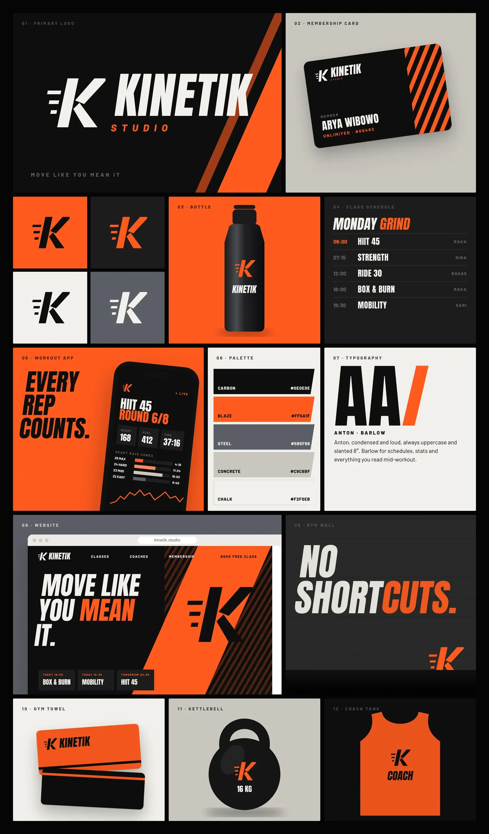
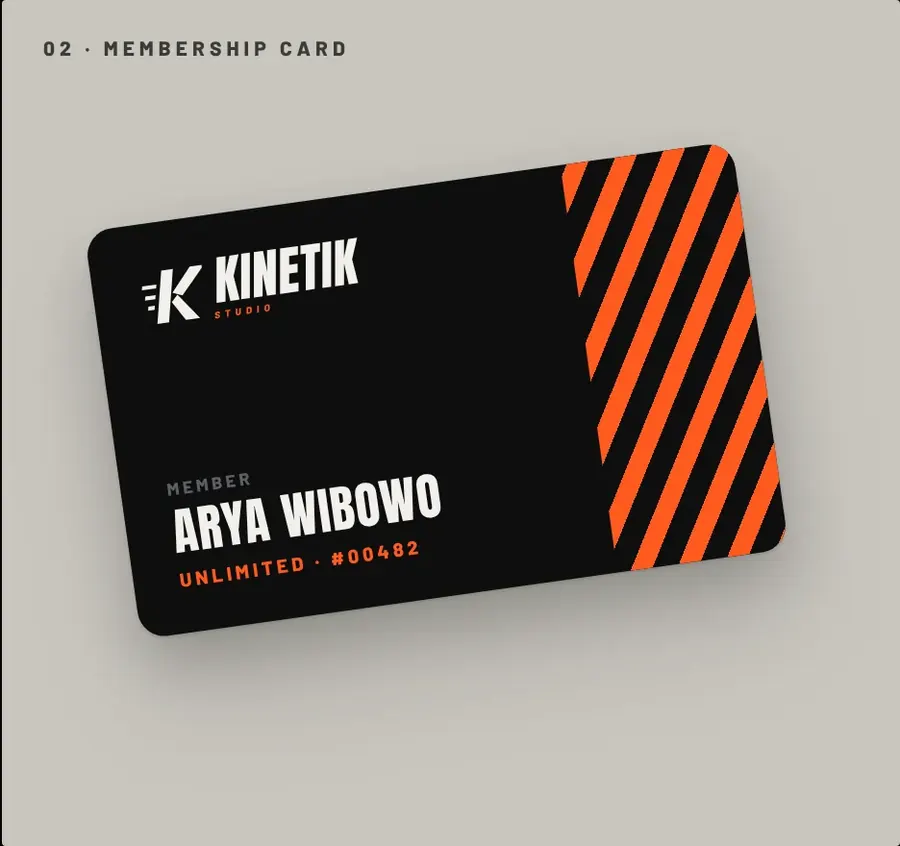
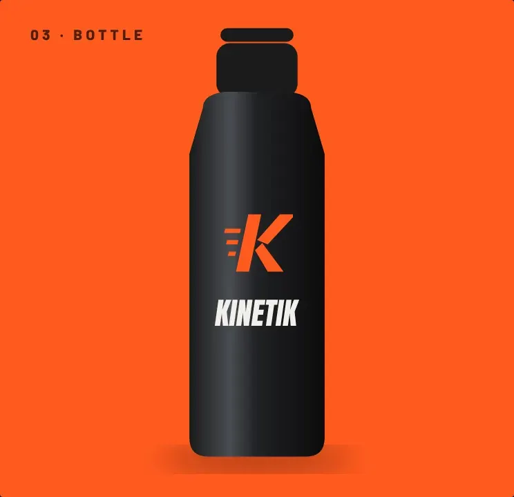
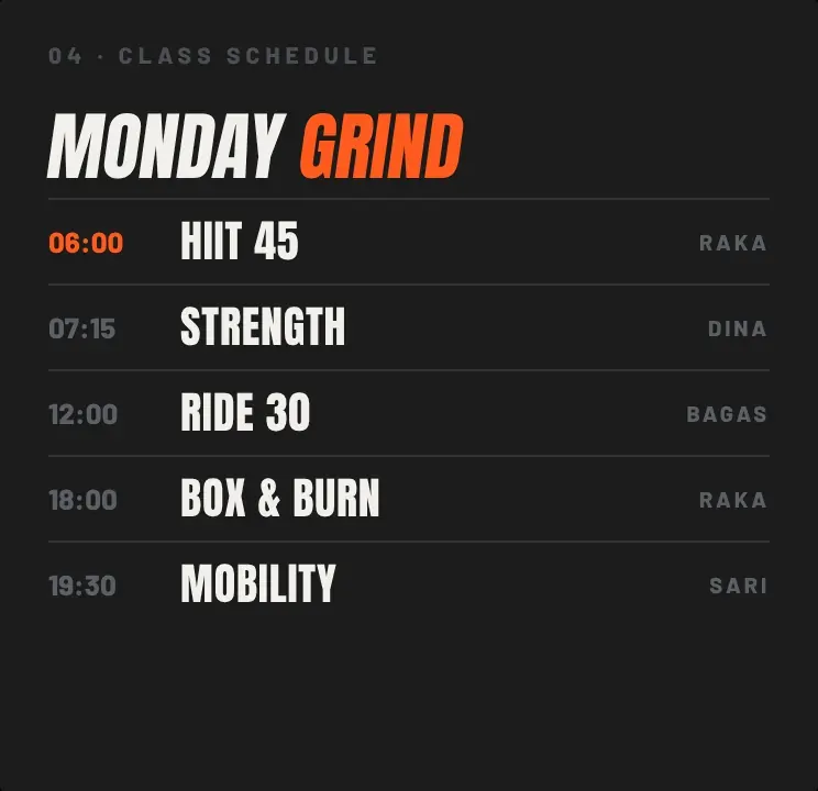
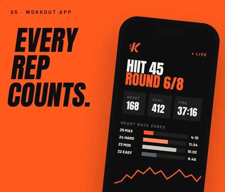
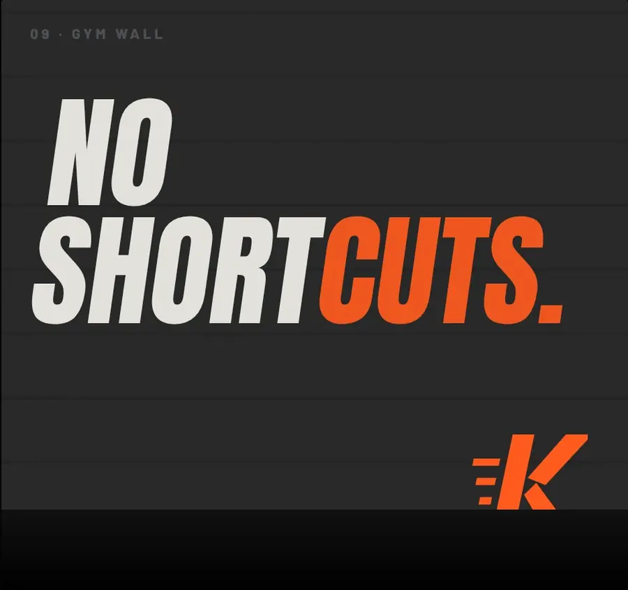
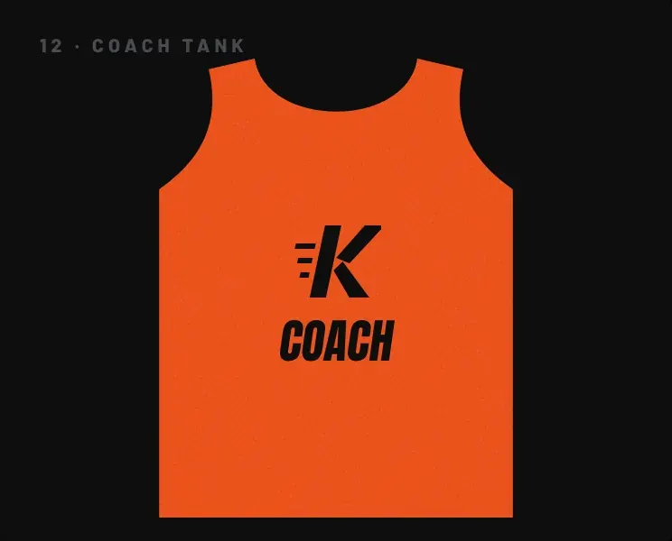
Membership card, steel water bottle, kettlebell branding, gym towel, coach tank top, class schedule, painted gym wall, workout-tracking app, booking website, and a social campaign (free first class, 30-day challenge, coach spotlight, new studio launch).
Brand board
The identity across print, packaging, digital and environment.
Identity system
The decisions behind the brand.
Logo
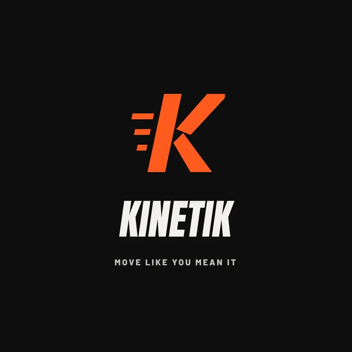
a slanted K with three speed lines, solid enough to paint three metres tall on a wall or emboss on a kettlebell.
Colour
Carbon #0E0E0E and Char for the room, Blaze #FF5A1F for effort and calls to action, Steel and Concrete for the equipment, Chalk #F2F0EB for clean contrast.
Typography
Anton, condensed, uppercase and slanted, for headlines that shout across the room; Barlow for schedules, stats and app data.
Voice
short, direct, motivating. "No shortcuts." "Every rep counts." "First class free."
Applications
Selected touchpoints from the identity.
Website
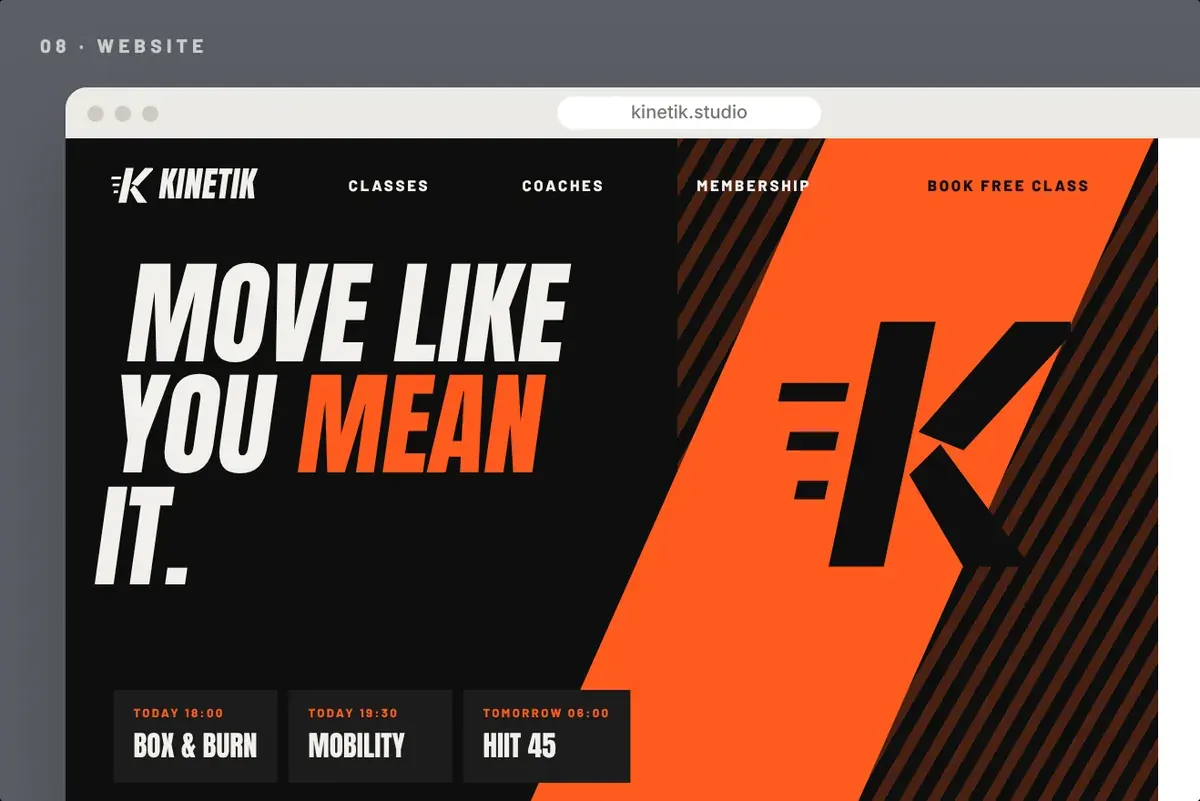
The identity carried into the online experience.
Social campaign
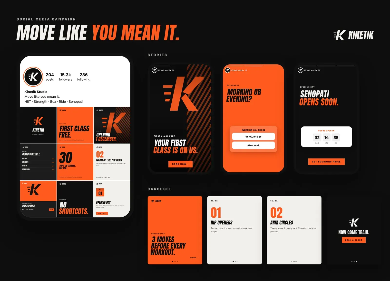
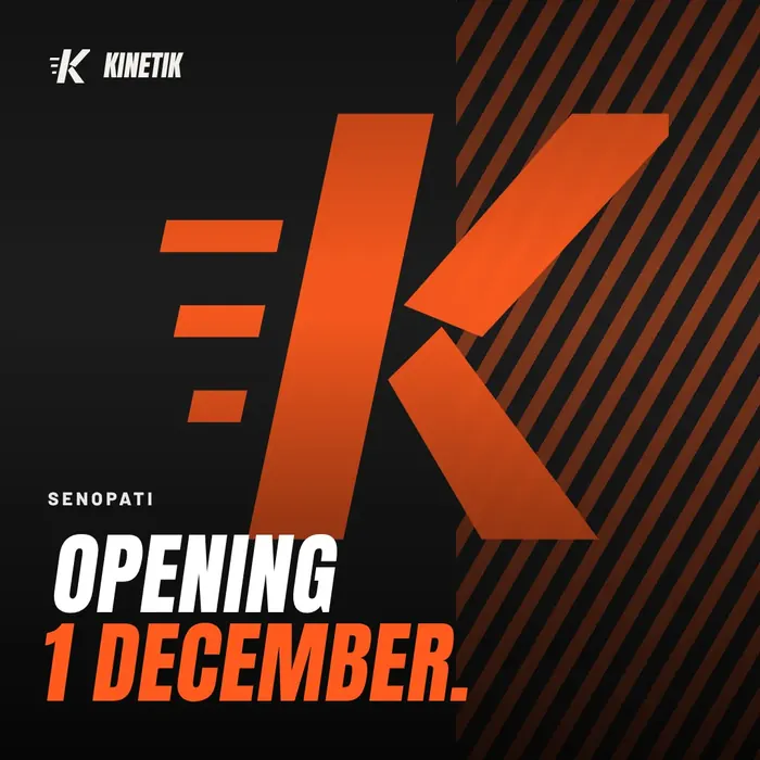
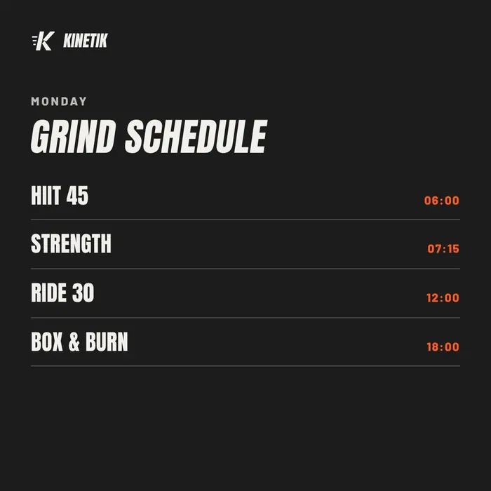
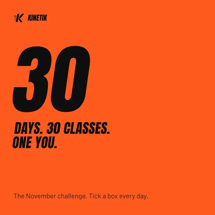
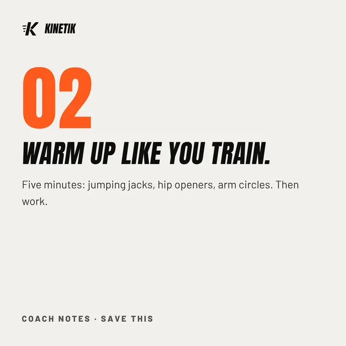
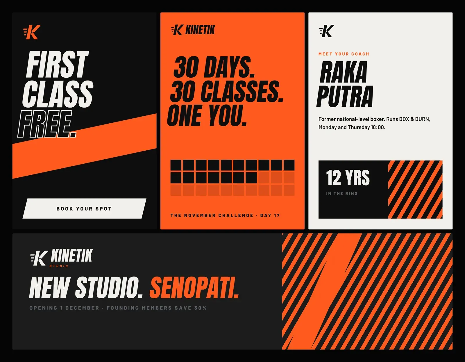
“Move Like You Mean It”. A studio-opening campaign: free first class, the 30-day challenge, coach spotlights and the weekly schedule, loud and direct.
Feed posts
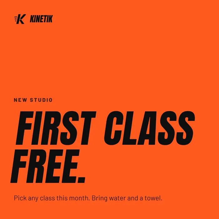
Six posts from the nine-post grid, 1080 × 1080.
Ad creatives
Story, feed and banner formats for paid social.
Concept project: a fictional brand created to show our brand-identity process. Names, prices and offers are illustrative.
What we delivered
Everything handed over at the end of the project.