Halden Estates
Real estate · Brand identity
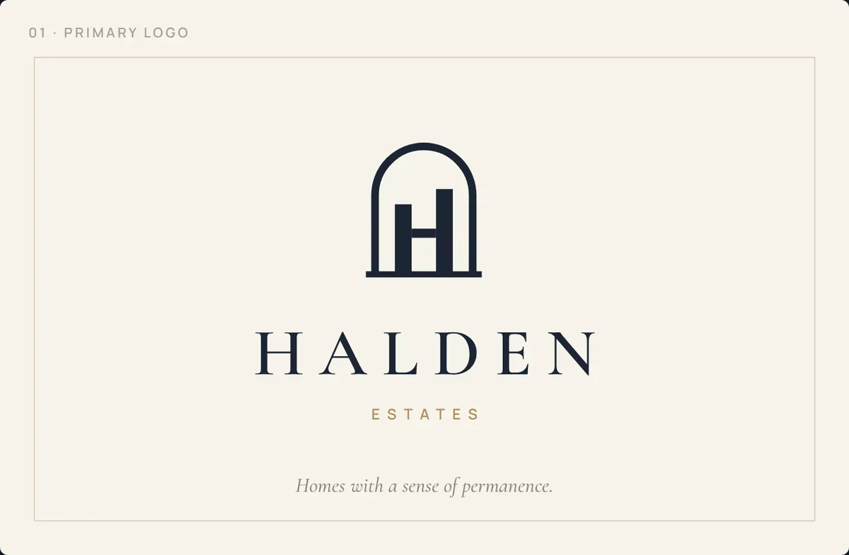
Halden Estates sells and lets high-end homes in South and Central Jakarta. The identity trades the loud, glossy look of the property market for something quieter: an arched mark built from two towers, a classical serif, and a palette of ink navy, sandstone and brass that feels like architecture rather than advertising.
The brief
Create a residential agency brand for buyers spending IDR 5–30B who are tired of cluttered property portals and pushy agents. It had to feel trustworthy and established from day one and work on site boards, brochures, a listings website and social media.
The idea: permanence
Good homes outlast trends. Every choice, from the name to the stonework palette, aims to feel like it has always been there.
Where it lives
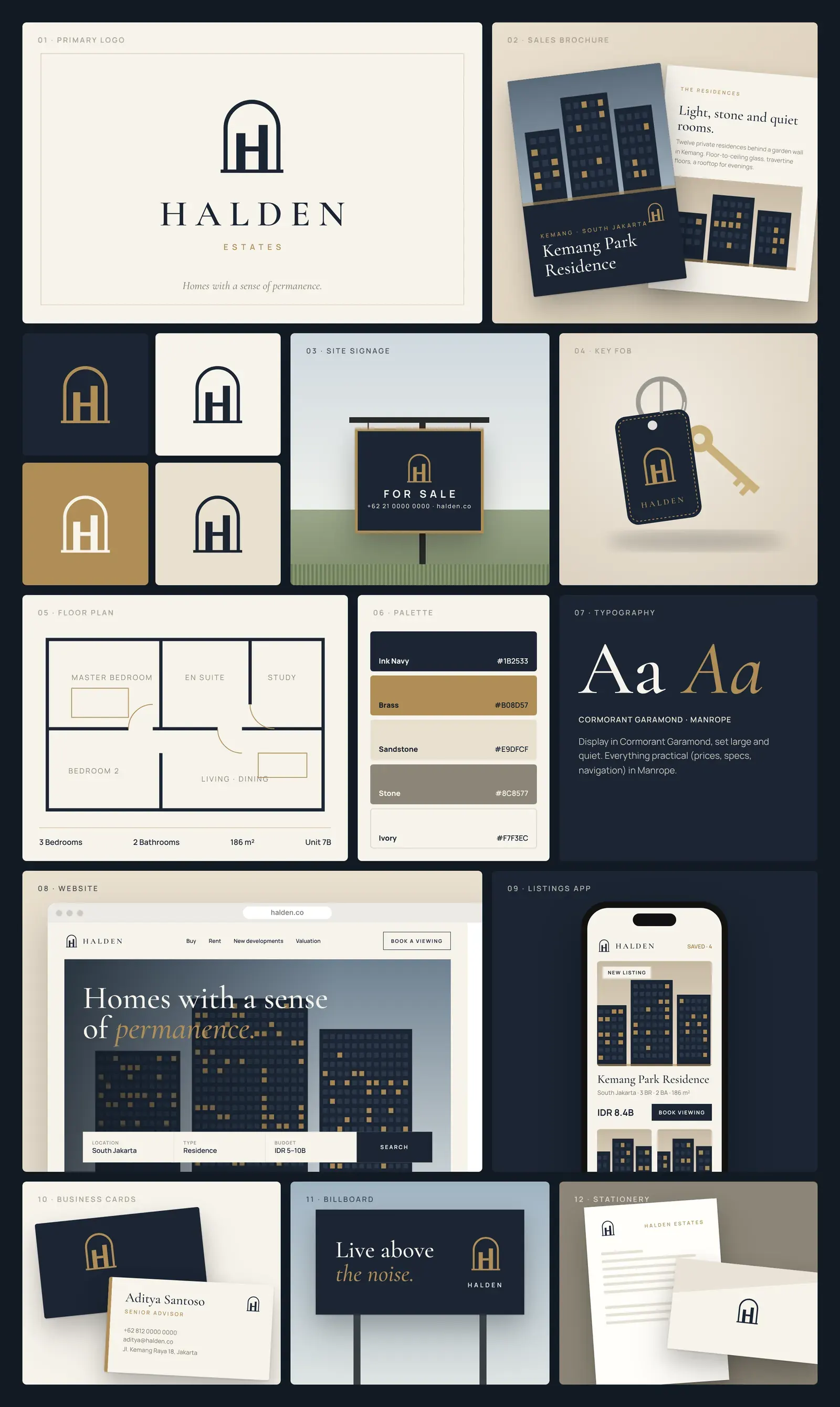
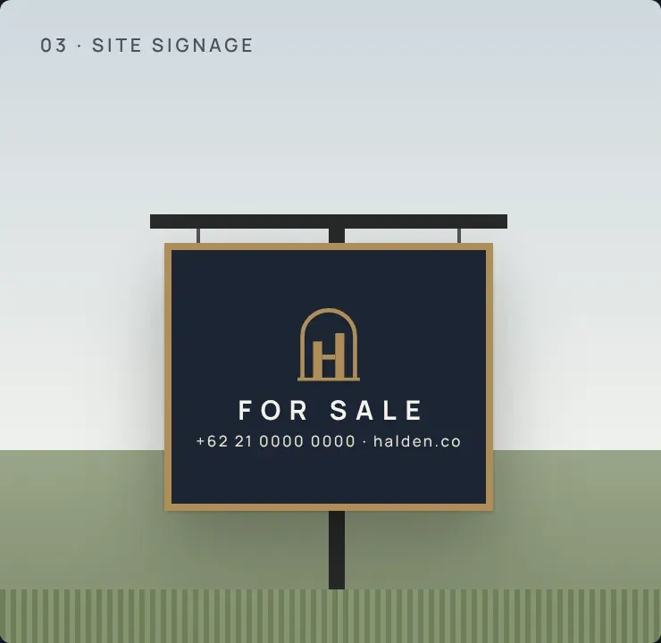
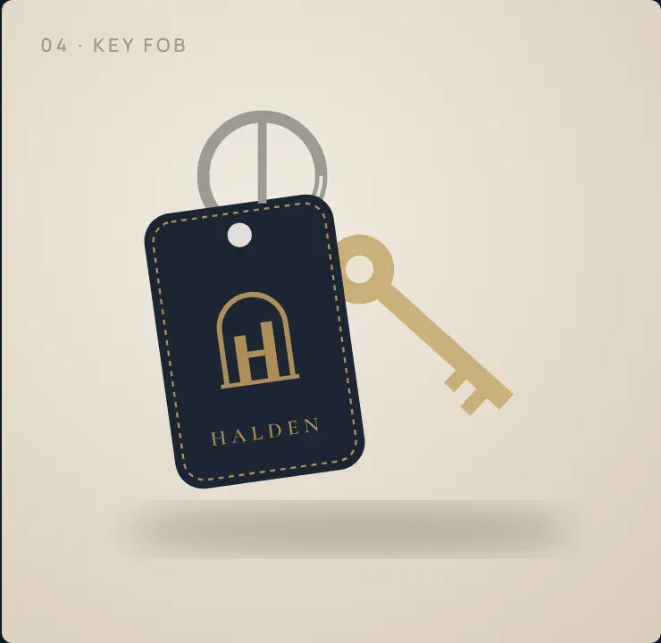
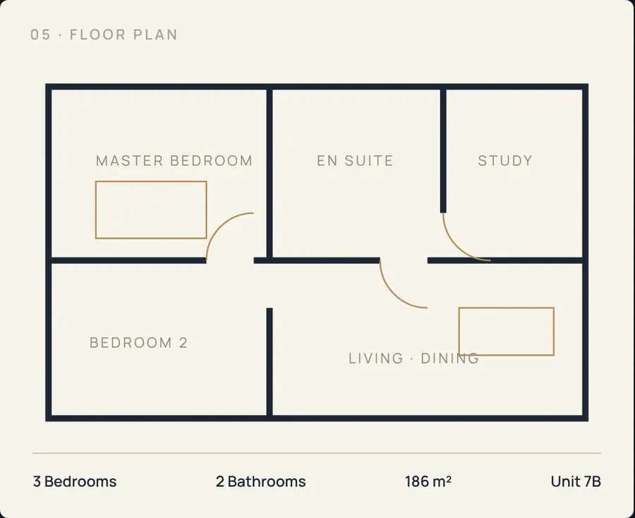
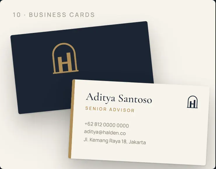
Sales brochure, site "For Sale" signage, leather key fob, floor-plan sheets, letterhead and envelopes, business cards, billboard, a listings website with property search, a mobile listings app, and an open-house social campaign.
Brand board
The identity across print, packaging, digital and environment.
Identity system
The decisions behind the brand.
Name
Halden sounds like a family name over an old front door: short, solid and easy to say in English and Bahasa.
Logo
an arched doorway framing two towers joined by a bridge, which forms an H. It reads as a home, a building and an initial at once, and holds up at 24px or on a 3-metre billboard.
Colour
Ink Navy #1B2533 for trust, Sandstone #E9DFCF and Ivory #F7F3EC for warmth and light, Brass #B08D57 as a single precious accent (door handles, key tags, foil), and Stone #8C8577 for quiet supporting text.
Typography
Cormorant Garamond for large, unhurried headlines; Manrope for prices, specs and navigation, so information stays clear.
Voice
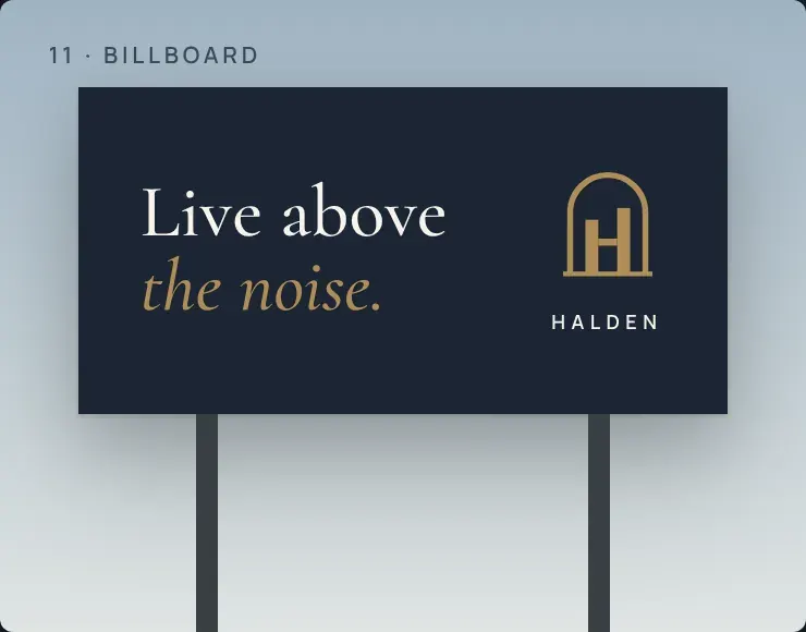
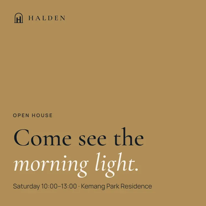
few words, said calmly. "Live above the noise." "Come see the morning light."
Applications
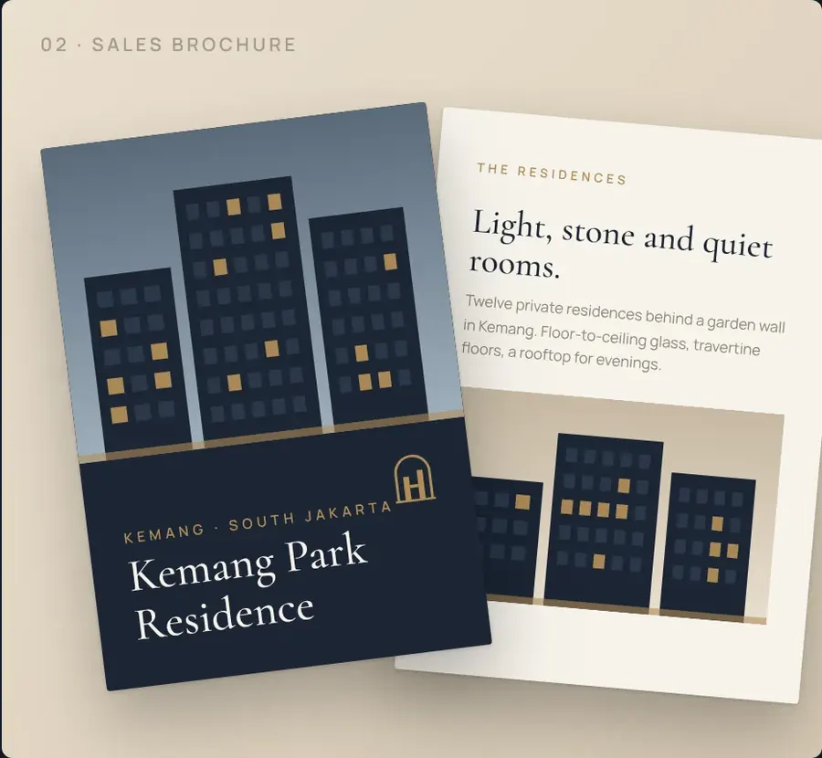
Selected touchpoints from the identity.
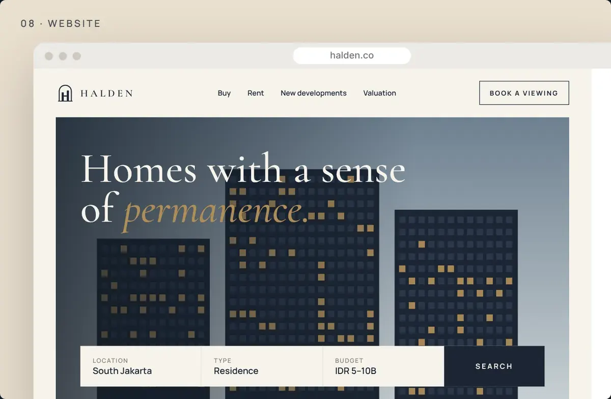
Website
The identity carried into the online experience.
Social campaign
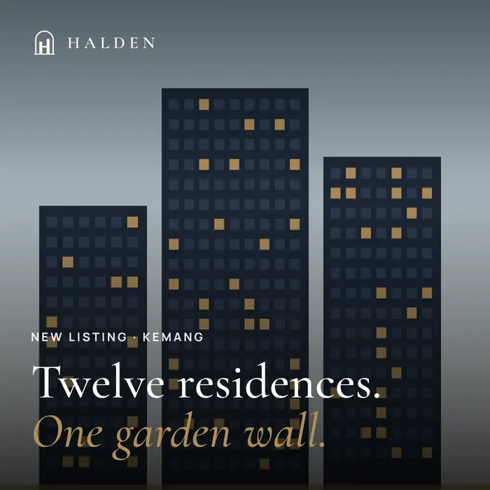
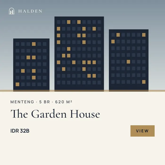
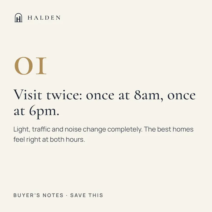
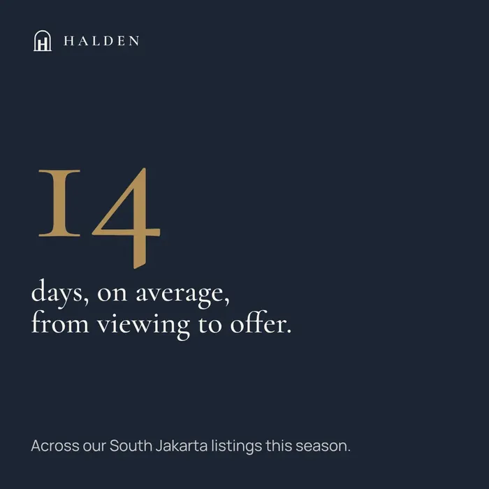
“Open House Season”. A month-long Instagram campaign announcing new listings, private open houses and free valuations, in a calm, editorial voice.
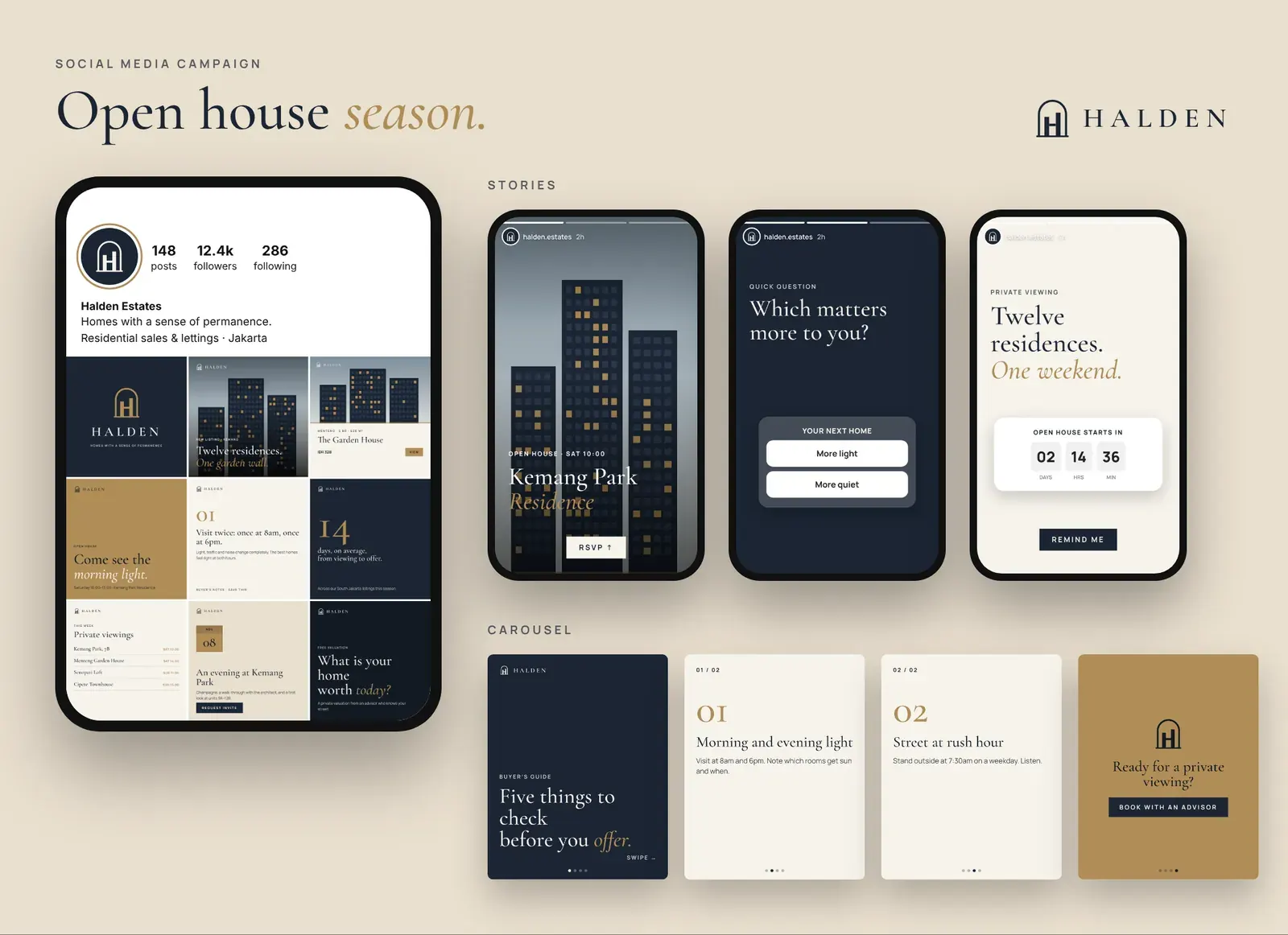
Feed posts
Six posts from the nine-post grid, 1080 × 1080.
Ad creatives
Story, feed and banner formats for paid social.
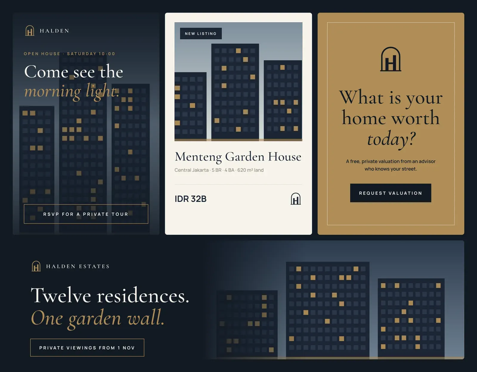
Concept project: a fictional brand created to show our brand-identity process. Names, prices and offers are illustrative.
What we delivered
Everything handed over at the end of the project.
Logo suite (mark, lockup, 4 colourways)
Colour & type system
Brochure layout
Signage
Key fob
Floor-plan style
Stationery
Website & app UI
Social media templates
Amerta Ubud