Lumea
Skincare · Brand identity
Lumea makes a short, honest skincare routine (cleanse, treat, seal) for people overwhelmed by ten-step regimes. The identity pairs a drop that holds a crescent moon with a refined Bodoni wordmark, arched frames and a palette of ivory, blush, clay, sage and cocoa, so the brand feels calm, warm and quietly premium.
The brief
Launch a local skincare brand that competes with imported "clean beauty" on trust and calm, not hype. Packaging had to look beautiful on a bathroom shelf and in an Instagram grid, and scale from a serum to jars, tubes and sample sachets.
The idea: light, gently
Lumea comes from lumen (light). The brand promise is a glow that comes from caring for the skin slowly and simply, not from covering it up.
Where it lives
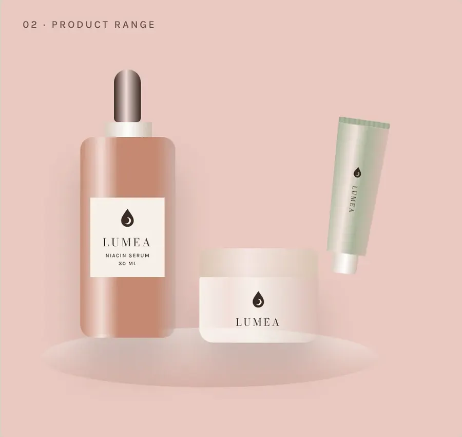
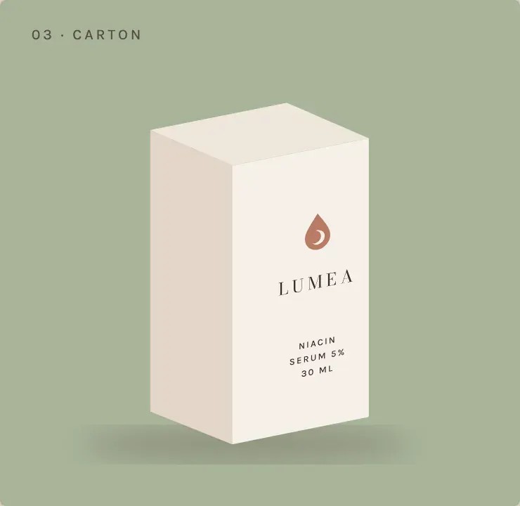
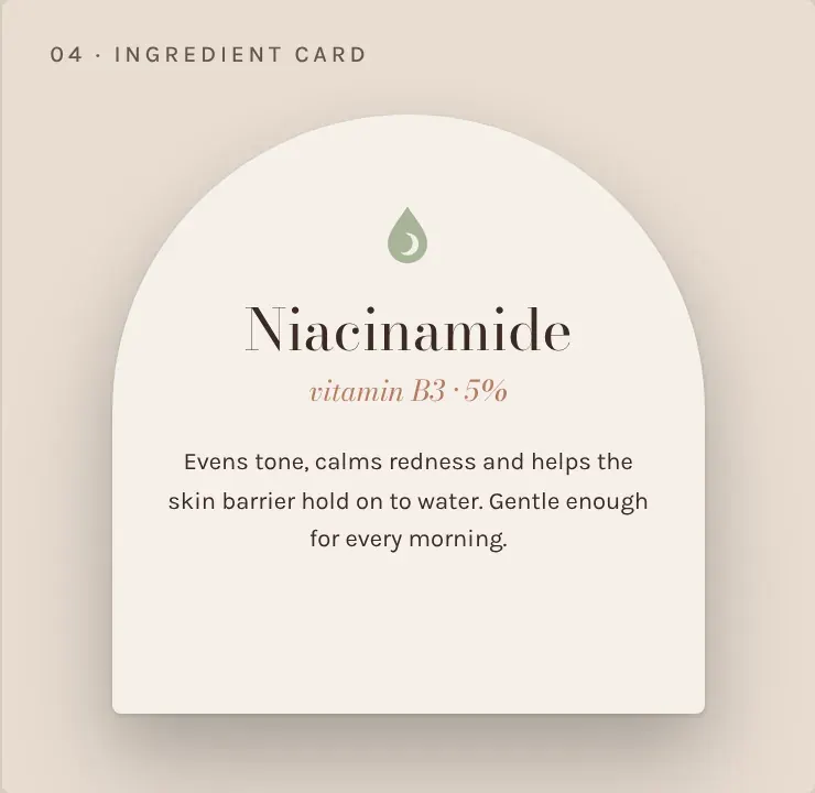
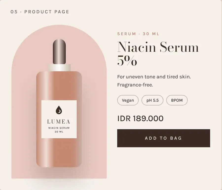
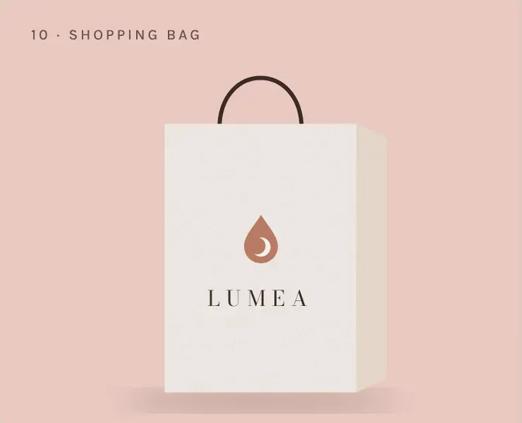
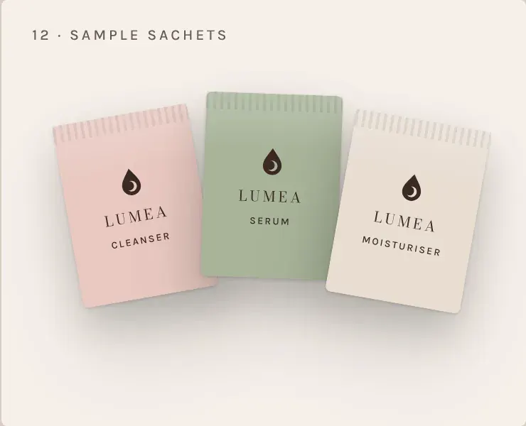
Serum, jar and tube packaging, carton, sample sachets, ingredient card, thank-you card, shopping bag, product page, website, Instagram grid, and a launch campaign (ritual set, 3-step routine, new barrier cream).
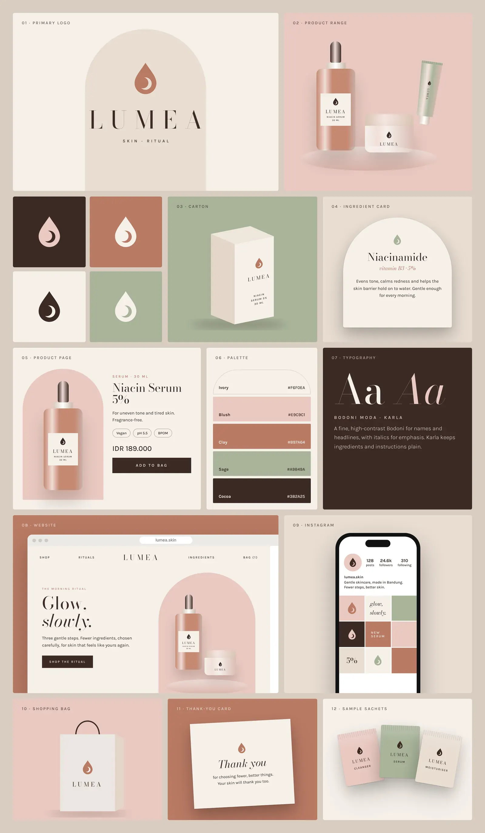
Brand board
The identity across print, packaging, digital and environment.
Identity system
The decisions behind the brand.
Logo
a drop of serum holding a crescent moon: day and night, morning and evening ritual.
Colour
Ivory #F6F0EA, Blush #E9C9C1, Clay #B97A64, Sage #A9B49A and Cocoa #3B2A25: skin tones and natural ingredients, never clinical white.
Typography
Bodoni Moda for names and headlines (italics for emphasis); Karla for ingredients, instructions and prices.
Voice
calm and honest. "Fewer steps. Better skin." "Five minutes, morning and night."
Applications
Selected touchpoints from the identity.
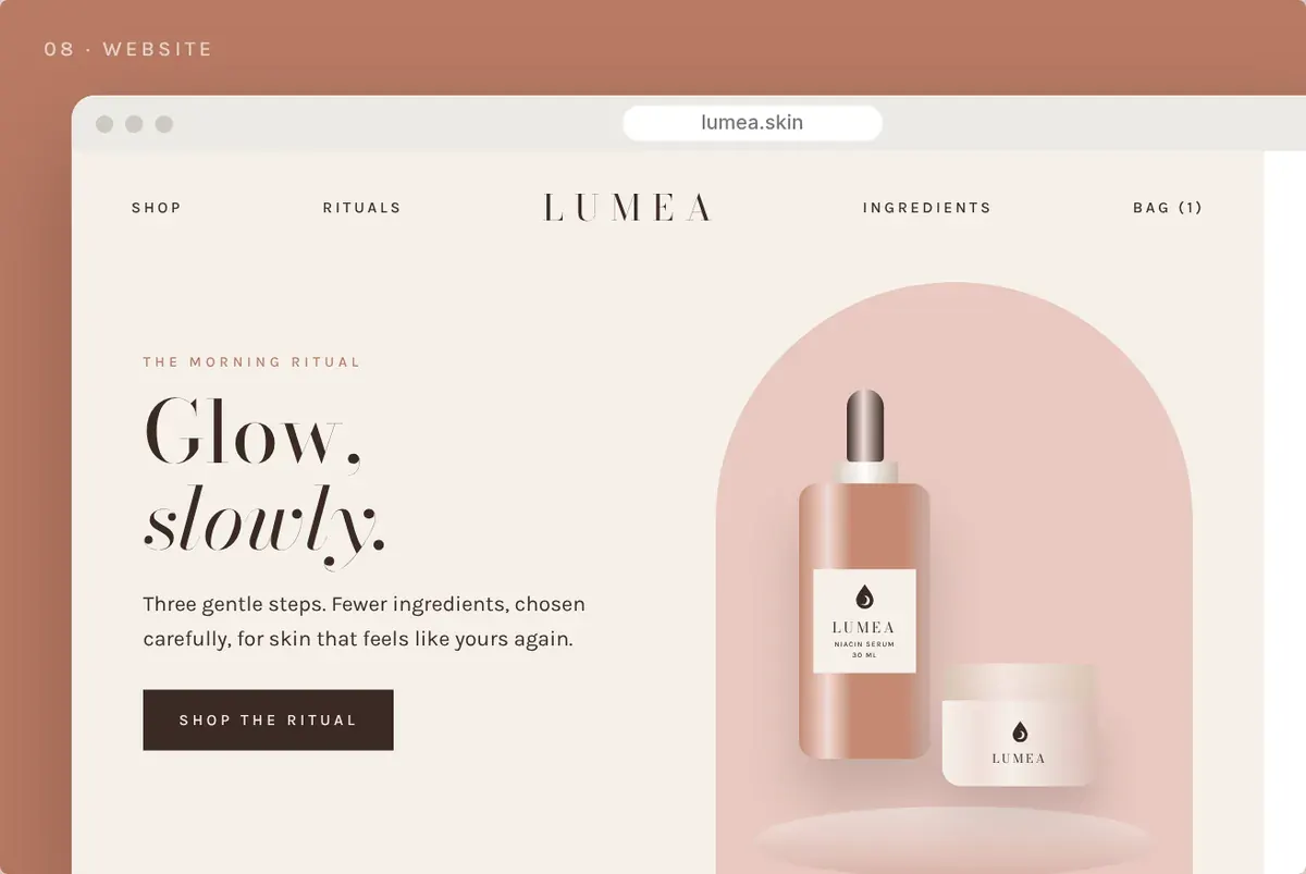
Website
The identity carried into the online experience.
Social campaign
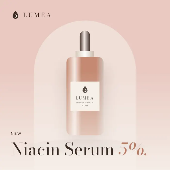
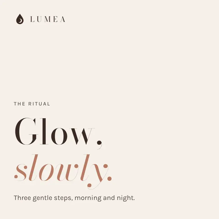
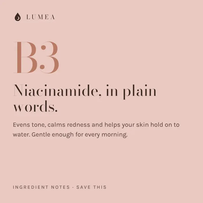
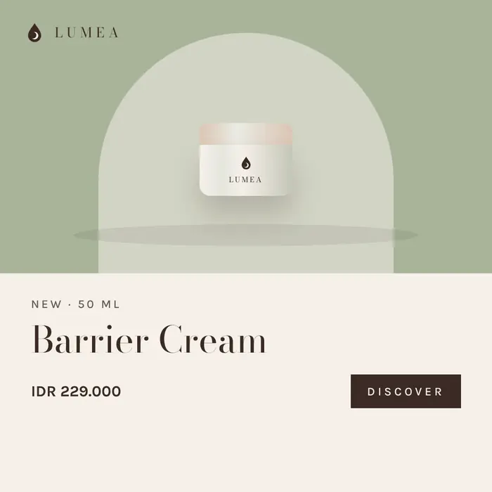
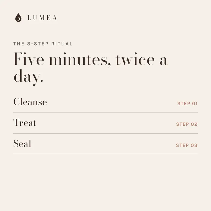
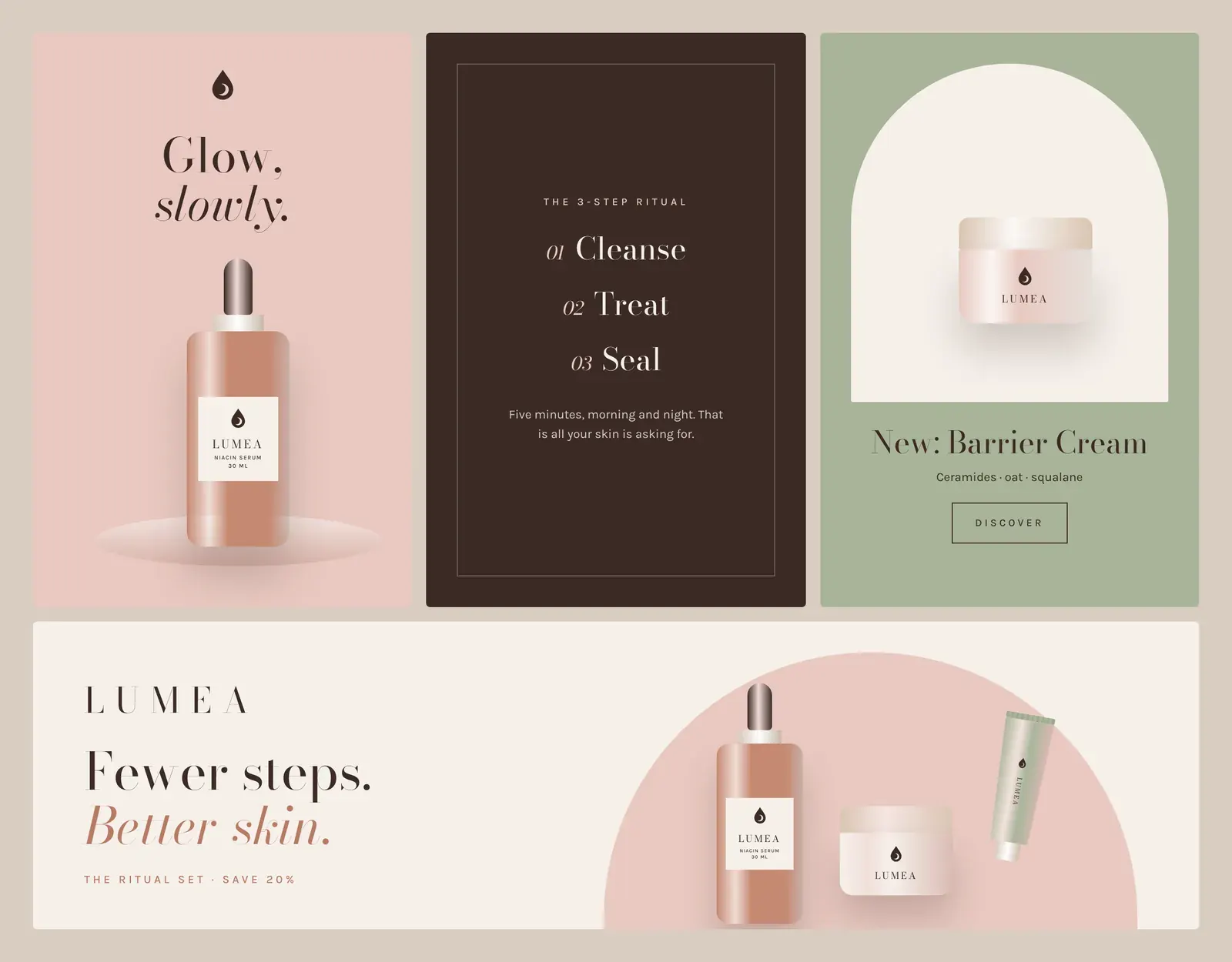
“Glow, Slowly”. A launch and education campaign for a minimal skincare line: the three-step ritual, ingredients explained, and the new barrier cream.
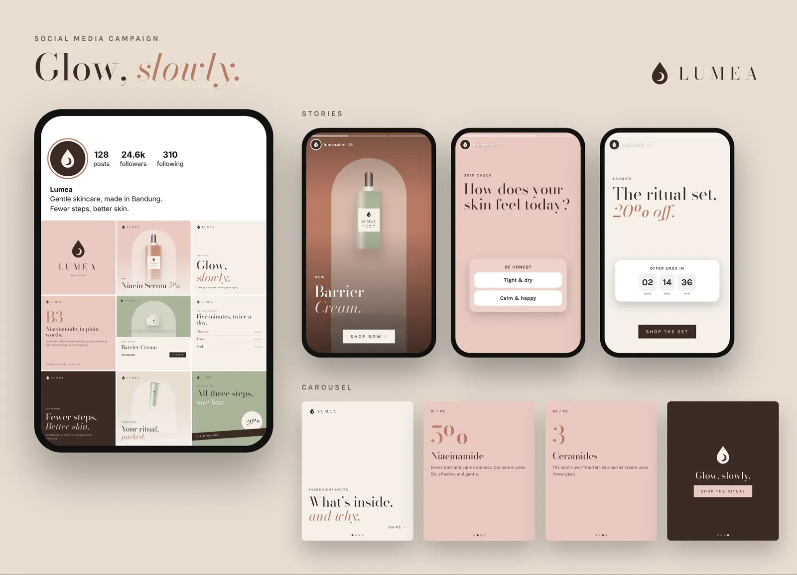
Feed posts
Six posts from the nine-post grid, 1080 × 1080.
Ad creatives
Story, feed and banner formats for paid social.
Concept project: a fictional brand created to show our brand-identity process. Names, prices and offers are illustrative.
What we delivered
Everything handed over at the end of the project.
Logo suite & colourways
Colour & type system
Packaging system
Print collateral
E-commerce & website UI
Instagram grid
Campaign templates
Kinetik Studio